Let’s say you’re signing up for a product. You see a welcome message on your screen. And that’s followed by a few steps on how to set up the product. You roll your eyes and think to yourself that this is going to require a lot of effort.
Now, one of these three things can happen:
- You click on random CTAs to get past the onboarding journey.
- You click on random CTAs and close your browser tab in less than two minutes because you’re annoyed.
- You pause, think, and input the correct details to understand the benefits of using the product.
The difference between these reactions lies in how interesting and relatable the user onboarding experience is. It can either welcome a user to understand your product’s value or chase them away.
Many companies struggle to nail user onboarding. It’s because they consider the ‘product’ to be the ‘hero.’ Their onboarding journey talks about how awesome the product is and prompts users to set up all the cool features. If these products have a ‘skip’ button on the onboarding screen, users will thank their lucky stars.
So, what does a good user onboarding experience look like?
Good user onboarding places the user at the centre. It uses research to identify the user’s problems and motivations and storytelling to guide them in achieving their goals using the product. It eliminates all forms of confusion and friction when users interact with the product.
For example, let’s take Descript.
They want to know me better.
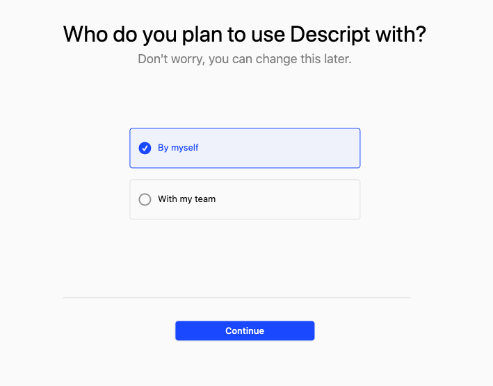
They want to understand my motivation behind trying the product.

They want me to learn more about Descript but are also respectful of my time.

The whole experience felt as if I was having a conversation with the product. And the product copy answered all the questions I had on my mind.
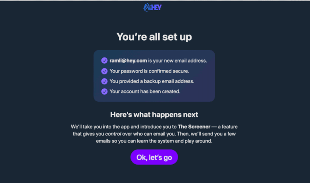
Some of you might be thinking of HEY, Basecamp, Superhuman, etc., as other examples for good user onboarding. Well, what these products have in common is a deeper understanding of how their users think and what their goals are.
They craft user onboarding journeys that are interactive, less boring, and speak the user’s language.
This experience puts users in a flow state where they fully immerse themselves in learning about the product.
Now, let’s look at some principles these products incorporate in their user onboarding:
#1 Being mindful of the user’s preferences and time

Basecamp offers some useful context about the product in the welcome message. It clarifies what Basecamp can do and how users can get started with the product. They also ask the user’s permission before walking them through the product.
#2 Helping the user on what to do next and how to do it
HEY’s user onboarding succinctly explains what the user can expect from their next action and how to do it. Their intention is simple – they want the user to be on the same page as they are.
#3 Freeing the user from distractions
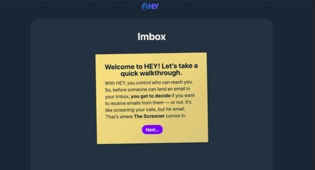
HEY nails it again. Even if users don’t read the product copy, they will feel good when they read the highlighted parts alone. E.g., “you get to decide” – a clear indication of control and ownership that users long for.
The users can then go ahead and click on the ‘glowing choice,’ i.e., the Next… button to continue learning about the product.
#4 Providing clear and immediate feedback

Superhuman walks their users through all the necessary steps to manage their inbox effectively. In the above example, as soon as a user hits the shortcut keys to move down the inbox, Superhuman compliments them for doing it correctly. This positive remark helps boost the user’s confidence.
Some common mistakes…
Some products show text-heavy screens and bombard users with checklists. They want users to discover all the product features instead of building an experience that focuses on the user’s goals. They believe blindly implementing checklists is the best way to gamify the onboarding experience; paying less attention to the principles behind ‘gamification.’
Similarly, some products prompt users to invite their team early on in the onboarding process. They attribute this action to triggering a network effect. But what they fail to understand is why users would care to invite their team before they even know if they like the product? That’s why it makes sense to place this step after the user has derived some value from the product.
All you’ve got is a couple of minutes to convince users why they should choose your product over the most common alternatives. If you fail to nail the onboarding experience, you will lose them forever.
Crafting a user-centric onboarding indeed requires high effort. But the rewards are high too.

Very interesting read! I relate to #1 when using some of the software products in my industry. I also like the point about asking the user about what they wish to do. I relate to it for something on my wishlist for my product.
A recurring challenge I keep facing is to guide the users through a workflow which is creating an incremental value for them, the more they dive deeper into it. However, to keep the interface light, we end up folding things one over another and wish for the user to click that drop down or the hamburger icon to modify things. If I start writing a tutorial or even create a video, it tends to get lengthy after all 13-14 steps. Have you seen any “workflow help” examples for users that are new to a feature but not the entire product? I needs to be something that can invite and guide the user through next steps.
I remember the wizards that Microsoft Office products used to have (looked like a stethoscope) and it would ask you mechanized questions on what you want to do next. Not sure how it died, but I see a scope for something like that here.
LikeLiked by 1 person
That’s a great point. Even I’ve not come across extraordinary feature walkthrough examples, yet. Most apps incorporate a combination of intrusive popups and highlighters to educate users. I’m not a fan of this approach. Let me know if you come across something interesting. 🙂
LikeLike